
Even if your pharmacy is already doing pretty good, there are still more things you can do to further rake in new customers and increase sales. Especially if you do more than just prescription pickups, you need to showcase any extra and value-added services front and center. If you offer immunizations, health screenings, or even wellness consultations, all the more reason to make those offerings impossible to miss on your promotional materials.
One of the best ways to highlight your unique value is with flyers that grab attention and communicate your message instantly. Here are some design hacks to make sure that your pharmacy flyers are doing the work!
1. Make the color palette on brand
Consistency builds trust. The human brain is really wired to seek patterns. Thus, when colors are consistent, customers tend to perceive the brand as more stable and dependable. Not to mention, a cohesive color palette can make your design feel clean and professional.
You can just refer to the colors of your logo, but in color psychology, the following colors are great for health-focused pharmacies:
- Blue: Trust and reliability
- Green: Health and healing
- White: Cleanliness and purity
- Orange: Warmth and attention-grabbing
Use these colors thoughtfully to reinforce your pharmacy’s identity and create a trustworthy and welcoming impression.
2. Highlight your current deals
Everyone loves a good deal. Whether it’s “Buy One Get One Free,” “20% off Vitamins,” or “Free Consultations”, feature them prominently and make sure they are easy to spot. Make your offer extra enticing and present it in a way that is bold, visually distinct, and easy to read at a glance. To make it stand out even more, callout shapes or contrasting backgrounds can help further draw attention.
3. Add a Limited-Time Offer or Discount
Limited-time offers work because they tap into the scarcity principle—when people believe something is only available for a short time, it becomes more valuable and thus urgent in their minds. Use phrases like “Offer ends this Sunday!” or “Limited-time flu shot discount.” These types of statements increase foot traffic and encourage quicker decision-making. Make this text pop up even more by using a bright accent color that makes it impossible to miss.
4. Use bold and professional fonts for headings
Headings are the very first thing people see, so they should be bold, clear, and easy to read. You don’t have to go too crazy about font style since pharmacy flyers are better off looking clean, credible, and easy to scan. Simpler options like Open Sans, Montserrat, or Lato will do. Additionally, keep heading font sizes larger for that visual hierarchy and avoid using too many fonts, which can only make the flyer look cluttered and confusing.
5. Include High-Quality Images with Clean Backgrounds
Don’t make the mistake of using low-resolution photos or generic stock images that don’t really reflect your pharmacy’s actual offerings or atmosphere. Use high-resolution photos relevant to your services, like smiling pharmacists, shelves stocked with your best-selling products, or customers receiving care. If you want to add real photos that need cleaning up, use an AI Background Remover to remove anything distracting.
6. Place Your Logo and Contact Info at the Bottom
Support clear branding by making your logo prominent and your contact info easy to access at the bottom. Pair it with ample white space to ensure it stands out without cluttering the main message. This keeps the flyer looking balanced and allows readers to quickly find how to reach you when they’re ready to take action.
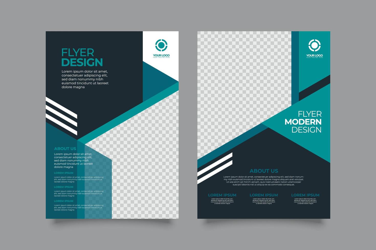
7. Use Free Templates to Save Time and Effort
No design background? Not a problem. There are lots of free pharmacy poster templates you can readily use and customize. You no longer have to think about layout, color combinations, and font pairing. Work smart and just build on professionally designed templates.. However, make sure to customize them with your brand’s unique details to avoid a dull and generic look.
Bonus Tips
- Add a QR code for quick access to your website, online booking, or special promotions.
- Use icons and other graphics to further illustrate your services and make your flyer more engaging.
- Keep it clean—cluttered flyers will only overwhelm and lose readers.
- Print on glossy paper to give a more premium and eye-catching look
- Test your design before mass production. That way, you can catch any errors and ensure the flyer looks great in print.
Make Your Pharmacy Flyer Count
It may seem like flyers are just marketing tools, but they’re actually an extension of your brand and customer experience. Every element of your pharmacy flyer represents your professionalism and commitment to care. Put intention behind every detail and consider it a great way to introduce your unique services and care philosophy. Start creating a standout flyer and let your design do the talking!